Understanding the visualizations
Player’s visualization
One image per player is produced by spectrumwars_plot in the specified
output directory. Images are saved to files named player0.png,
player1.png, etc.
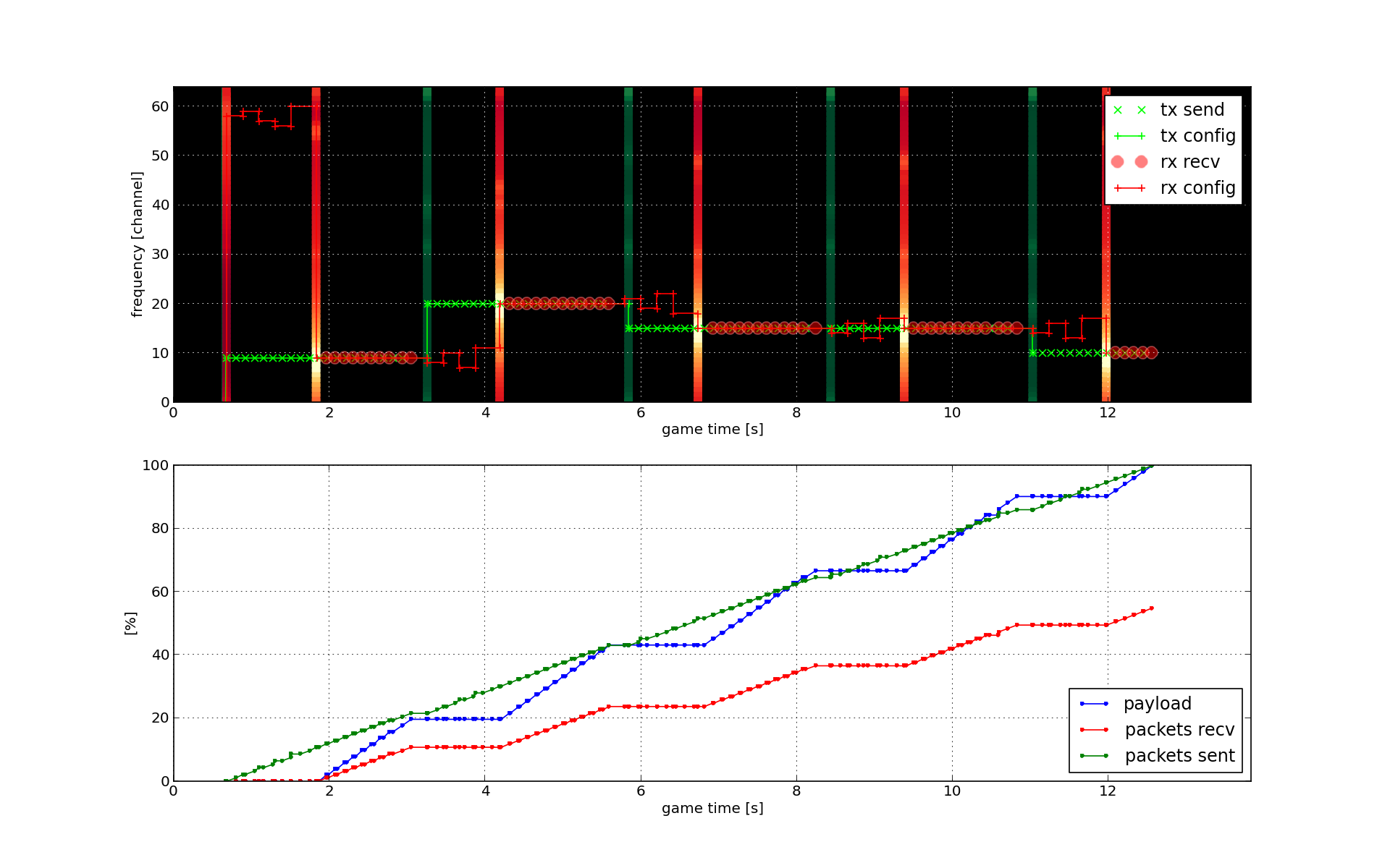
The upper graph with the black background shows the progress of the game in a time-frequency diagram. Game time is on the horizontal axis and frequency channels are on the vertical. Key events in the game are displayed in this diagram with the focus on the current player.
- Red color marks events related to this player’s
Destinationclass,- green color marks events related to this player’s
Sourceclass and- gray color marks events related to other player’s transceivers.
Since only one player participated in this game, there are no gray color markers on the diagram shown above. The behavior of the single player can be seen from the following markers:
- Green crosses show transmitted packets from the player’s
Sourceclass. These correspond to calls to thesend()method.- Red circles show packets, that were successfully received by the player’s
Destinationclass.- Thick green and red vertical lines show spectral scans by the source and destination respectively. These correspond to calls to the
get_status()method, or when thestatus_update()event happens. The lines vary slightly in color to show the result of the spectral scan - lighter color means a higher detected signal level on the corresponding channel.- The small crosses connected with a thin green and vertical lines show the currently tuned frequency of the source and destination respectively. The lines shift in frequency for each call to the
set_configuration()method.
Note
Only packet transmissions are shown for other players.
Reading the specific diagram above, you can see that the source first started transmitting near channel 10. After around 3 seconds, it performed a spectral scan and shifted the frequency to channel 20. The destination on the other hand, attempted first to unsuccessfully receive packets around channel 60. Then it performed a spectral scan at around 2 second mark. After the scan it tuned to the source’s channel and started to successfully receive packets. This continued until the source jumped to channel 20, after which the destination started changing channels again in an attempt to restore packet reception.
The bottom graph shows progress of some performance indicators: percentage of transferred payload, transmitted and received packets. These are relative to the total payload and packet counts in the game.
Game visualization
One image per game is created by spectrumwars_plot in the specified
output directory. Image is saved to a file named game.png.
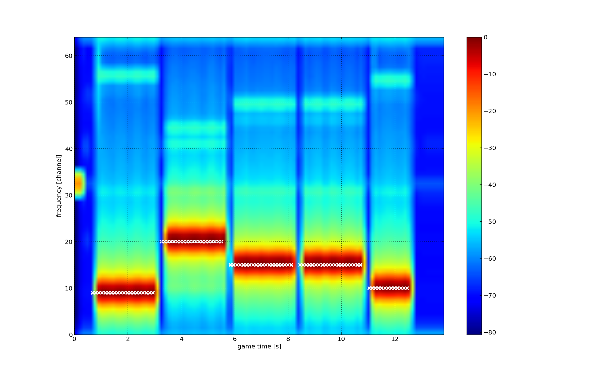
Similar to the upper graph in the per-player visualization, this graph shows a time-frequency diagram. The color on the diagram shows signal level, as reported by the actual spectrum sensor, for each channel and moment in time while the game was running.
The color bar on the right shows the mapping between the color and the
specific value that would be seen by player code at that time and channel if
it called the get_status() method.
Exact time and frequency of packet transmissions of all players in the game are shown superimposed over the diagram using small white crosses.